Count carbs from a photo
Take a picture of your meal. Get an estimate of its carbohydrates, so there’s less to work out yourself.
EVERYDAY HELP WITH DIABETES
Dia.best helps you estimate carbs from a food photo, follow your blood sugar and keep track of insulin — all in one place.
For people with diabetes and the families who care for them.

More room for
everyday life
From the food on your plate to the numbers on your screen.
Take a picture of your meal. Get an estimate of its carbohydrates, so there’s less to work out yourself.
See your readings, meals and insulin together. Spot patterns and ask the AI assistant to explain them.
Use your food, blood sugar and personal settings to help work out insulin needs. Review results before acting.
English widget examples: insulin pump and insulin pens
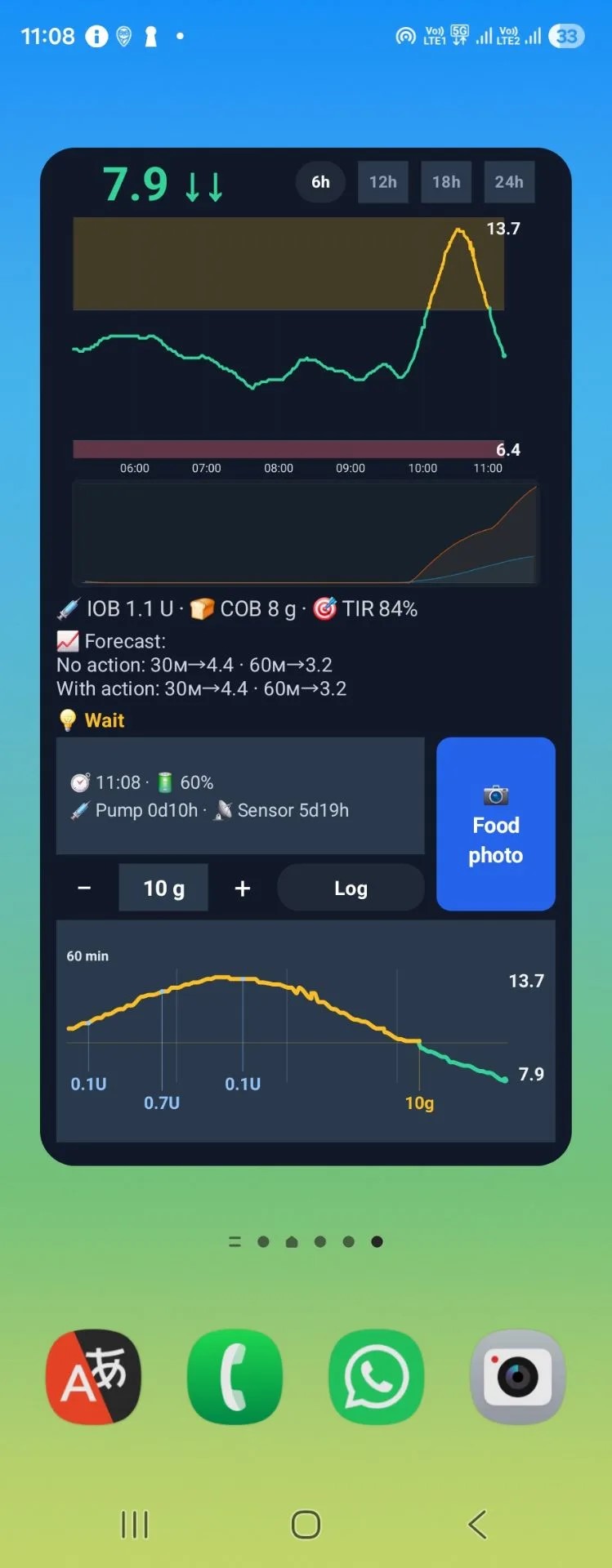
Insulin pump: automatic dose history, sensor and infusion-site timers, and a carb logging button.
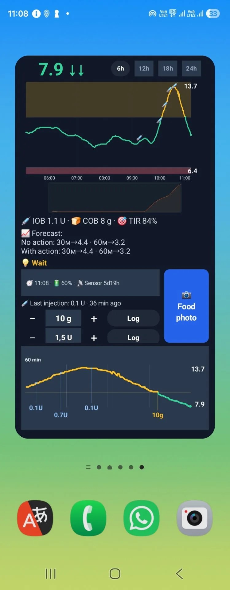
Insulin pens: injection markers, the last recorded injection, and separate carb and insulin logging controls.
Saved example screenshots, not your current readings.
Read the explanation of every element
EVERYDAY MOMENTS
A walk, a treat, time together. Keep the numbers and your action log close at hand.
Three everyday tasks, right from your home screen.
Glucose, direction of change and recent history — together on your phone.
Open the camera from the widget to estimate a meal’s carbs. Check the portion and the estimate.
Log carbs and insulin already taken. Connected Nightscout receives records through synchronization.
For calculations, set your personal ratios and targets. Suggestions depend on recent readings and complete records.
A COMPLETE GUIDE
25 elements, grouped by function. Select a label on the screenshot or open the full guide.
This is the latest sensor reading received. These examples use mmol/L. The arrow beside it shows the direction of change; the time below shows when the reading was taken.
See glucose on your home screen and check the reading time to judge how recent it is.
An up arrow means a rise, a down arrow means a fall, and a right arrow means little recent change. Both examples show two downward arrows, indicating a rapid fall.
The same reading can be followed by a rise or a fall. The arrow describes recent movement; the forecast below is a separate calculation about the future.
These buttons select the time shown on the main graph. These screenshots have the six-hour view selected.
Use a shorter view for recent meals and injections, or a longer view for the whole day. The lower graph still shows the last hour.
Time runs from left to right. Green shows readings from 4 to 10 mmol/L, yellow readings above 10, and pink readings below 4. The colored areas highlight values outside these limits.
These are the widget graph’s color thresholds. Your personal targets for calculations are set separately in your profile.
The right-hand numbers show the highest and lowest blood sugar values in the displayed graph. Times appear below the graph.
See how high or low blood sugar went and when it happened. These numbers are not your personal target values.
Mode: insulin pens
In the pen examples, syringe symbols mark recorded insulin injections. Their position in time helps you relate an injection to the changes that followed.
You do not have to remember the injection time. A marker is a record of an event, not a suggestion to inject again.
In the narrow strip below the main graph, the orange line estimates the action of rapid insulin already taken. The modeled effect builds after a delay, then fades. The effects of multiple doses are combined into one curve.
IOB estimates the amount remaining in units; this line shows how insulin action changes over time. Its height is neither a new dose nor a measured insulin effect.
Insulin on board is an estimate of earlier rapid insulin still counted as active. “U” means insulin units. For example, IOB 1.1 U is an estimate of active insulin remaining, not an instruction to take another unit.
The value depends on the available dose history and configured action duration. It may differ from AAPS IOB because Dia.best can recalculate it using its own model.
Also called carbs on board, or COB, this estimates remaining carbs from food already recorded. It is the value beside the bread symbol, not an amount suggested for you to eat now.
A previous meal may still affect blood sugar. This value helps account for that food alongside insulin.
Time in range is estimated from the available readings in the previous 24 hours: the percentage between 3.9 and 10 mmol/L (about 70–180 mg/dL). For example, 84% means 84% of those readings were in range.
This covers a rolling 24-hour window, not just today since midnight. Missing readings leave gaps in what the percentage can describe.
Mode: insulin pump
In the same narrow strip, the blue line estimates the action of background insulin, including basal delivery and temporary changes when their history is available.
See background action alongside the orange bolus curve. This blue line is not shown in the pen examples.
The two rows estimate blood sugar in 30 and 60 minutes. The first is calculated without an additional action; the second includes the action considered in the suggestion. Sometimes they match.
Compare possible outcomes and notice a potential fall or rise earlier. A forecast uses the available data; it does not promise an exact future reading.
The system may suggest waiting, taking carbs when it predicts a fall, or calculate insulin when a correction is needed. “Wait” means the calculation is not suggesting a new action at that moment.
The suggestion brings together blood sugar, food and insulin. It depends on your settings and complete records; compare it with fresh readings and how you feel.
The button opens the app’s food-photo flow directly. It estimates carbs from the photo; after checking the portion and entering your personal settings, you can use the insulin calculation.
Start from the widget without finding the feature in the app. Check the food and portion size because a photo provides an estimate.
Choose the carbs you ate using minus and plus, then tap Log. Tapping the number opens a small dialog where you can type and save the amount.
Record food from your home screen without navigating to the dashboard. The number selected for logging is separate from any system suggestion.
Mode: insulin pens
Pen mode adds a row for a dose you have already taken. Use minus and plus, or tap the number to type it. Use the button beside the insulin amount to save the record.
The record is used in your history and later calculations. The widget does not inject insulin or send a delivery command to a pump.
Mode: insulin pump
When AAPS or another compatible system uploads pump doses to your connected Nightscout, Dia.best receives those records automatically. The available history is used for dose markers and estimated insulin action.
You do not need to manually duplicate doses already uploaded by the pump system. The data source and synchronization must be configured.
Tap outside the widget’s individual buttons to open the app for more detail. Time-range, logging and photo buttons keep their own actions.
Keep a quick overview on your home screen, with full history and settings available in the app.
The time inside the widget corresponds to the latest glucose point received for the graph. It is different from the current clock in the phone’s status bar.
If this time is behind the phone’s clock, the displayed reading is older. Connection warnings may also say how long data has not been updated.
The percentage inside the widget is the battery level reported by the data source. With Nightscout, this is usually the phone uploading readings. A plug means the source reported that it is charging.
It may be your child’s phone rather than the phone showing the widget. A dash means the battery level is unavailable, not 0%.
Mode: insulin pump
The counter shows elapsed time since the recorded infusion-set or pump-site change. It uses the Nightscout Site Change event, with the saved start date as a fallback. The example “0d10h” means 10 hours.
It describes the current site or supply based on the recorded date. It is not the pump’s lifetime or the amount of insulin left in its reservoir.
The counter shows elapsed time since the sensor was inserted. For example, “5d19h” means 5 days and 19 hours, as in both examples. It uses the Nightscout Sensor Change event or the saved date in settings.
Keep track of the insertion date. A dash means no date is available; an incorrect saved date gives an incorrect age.
Mode: insulin pens
In pen mode, this row shows the last recorded injection and the time since it. The pen example shows 0.1 units, 36 minutes ago.
Recall a recent injection and avoid recording it twice. This is a past event, not a suggestion to repeat that dose.
The bottom graph shows the last hour of glucose, independently of the 6-, 12-, 18- or 24-hour range above. The right-hand numbers are the highest and lowest values in this window; the last dot is the latest received reading.
Yellow and green segments here describe glucose. Insulin action is shown higher up, in the separate narrow strip under the main graph.
Yellow labels in g show recorded carbs. Blue labels in U show insulin taken. A lilac SMB label identifies an automated microbolus when that event type is supplied. A leader line connects the label with its time position.
These are past events, not new instructions. Nearby records may be grouped to keep labels readable; a label can therefore show the sum of multiple events.
A dash or no-data message means a value is unavailable. It does not establish zero insulin, carbs or battery.
If the internet, server or data source cannot provide an update, the widget keeps the last received data and displays a warning. If sign-in is required, it asks you to open the app.
The widget can show that previously suggested carbs have already been accounted for and ask you to wait for their effect. This does not ask you to eat that amount again. That state is not shown in these two examples.
The record is sent to Dia.best; with a connected Nightscout, the service starts synchronization. Whether xDrip+ and AAPS receive it depends on the exchange settings and supported event types.
The widget follows the app’s language. Its rows follow the profile’s therapy mode: insulin pump or insulin pens. The last-hour graph can be hidden in settings.
MANAGED HOSTING
Nightscout is your own website for storing and viewing readings from your glucose sensor. Dia.best provides hosted Nightscout with a linked Dia.best account. See the upcoming plans and current availability.
See the upcoming hosting plans.
Some extra Dia.best features are paid.
Yes. Connect it in your Dia.best account. You don’t need to create another one.
The website works on Android and iPhone. The widget is for Android; the watch app is for Wear OS.
To see sensor readings, connect a compatible glucose app to Nightscout. Receiving entries in other apps depends on their sync settings and internet connection.
Both. Use the food and blood sugar diary, with additional tools for people using insulin.